CN
EN

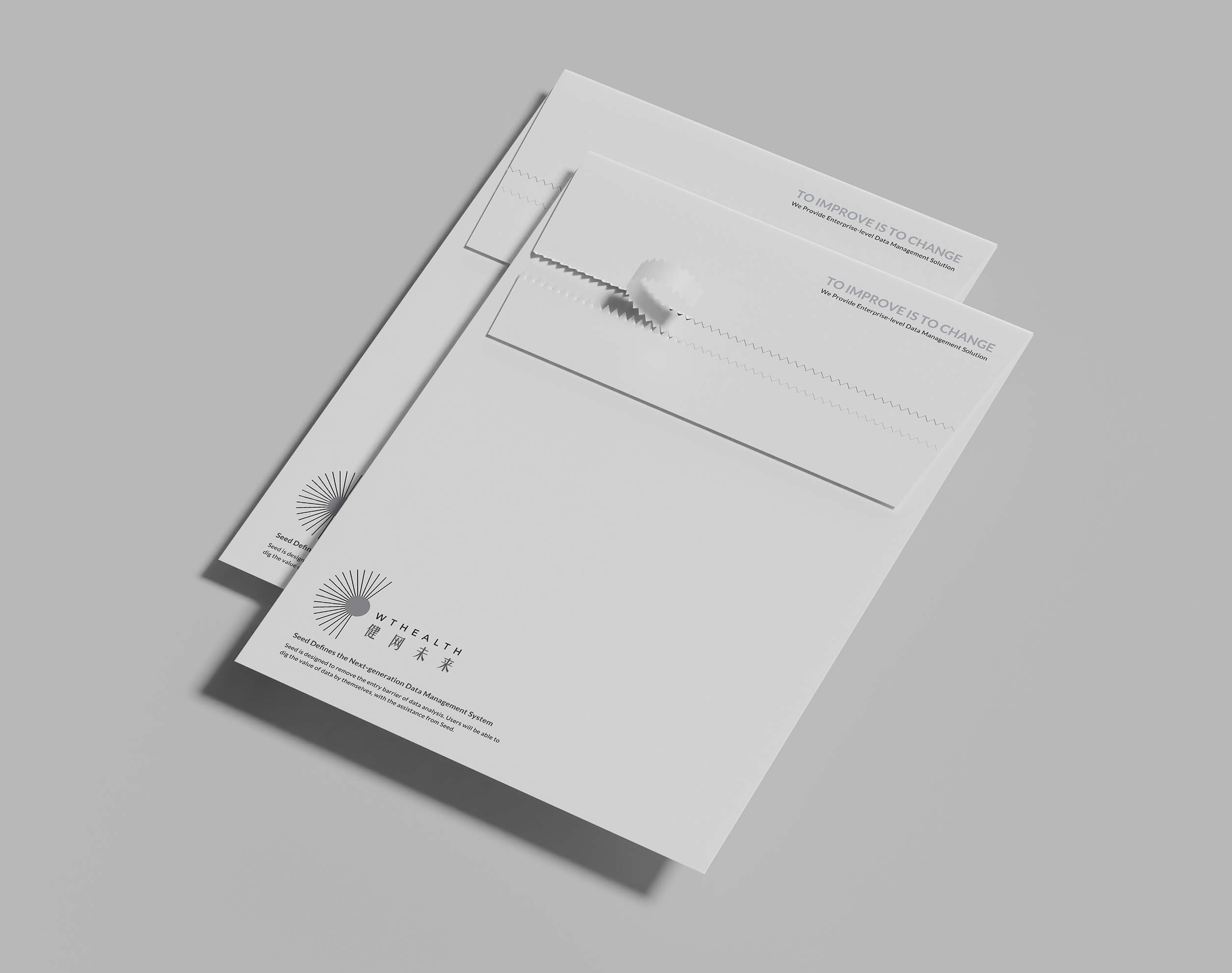
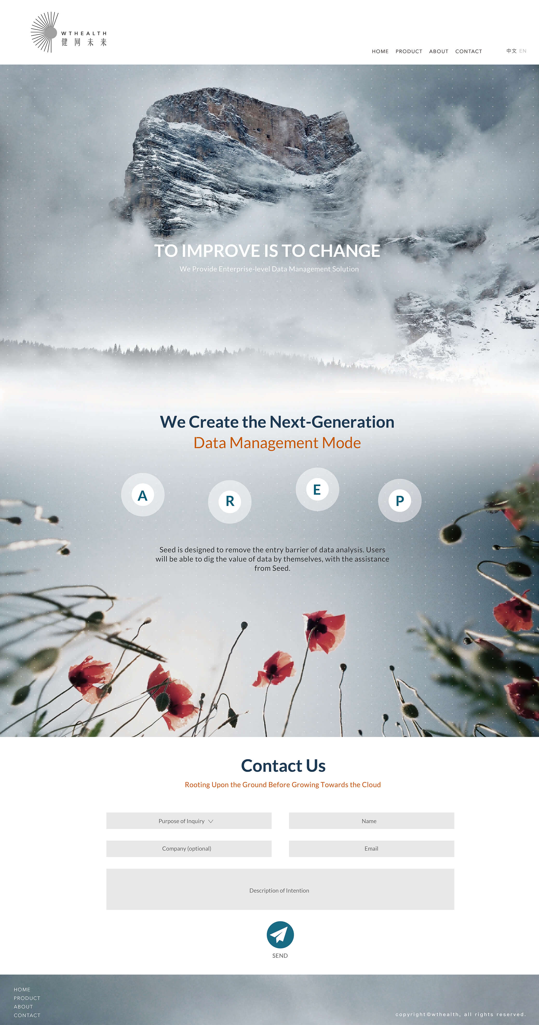
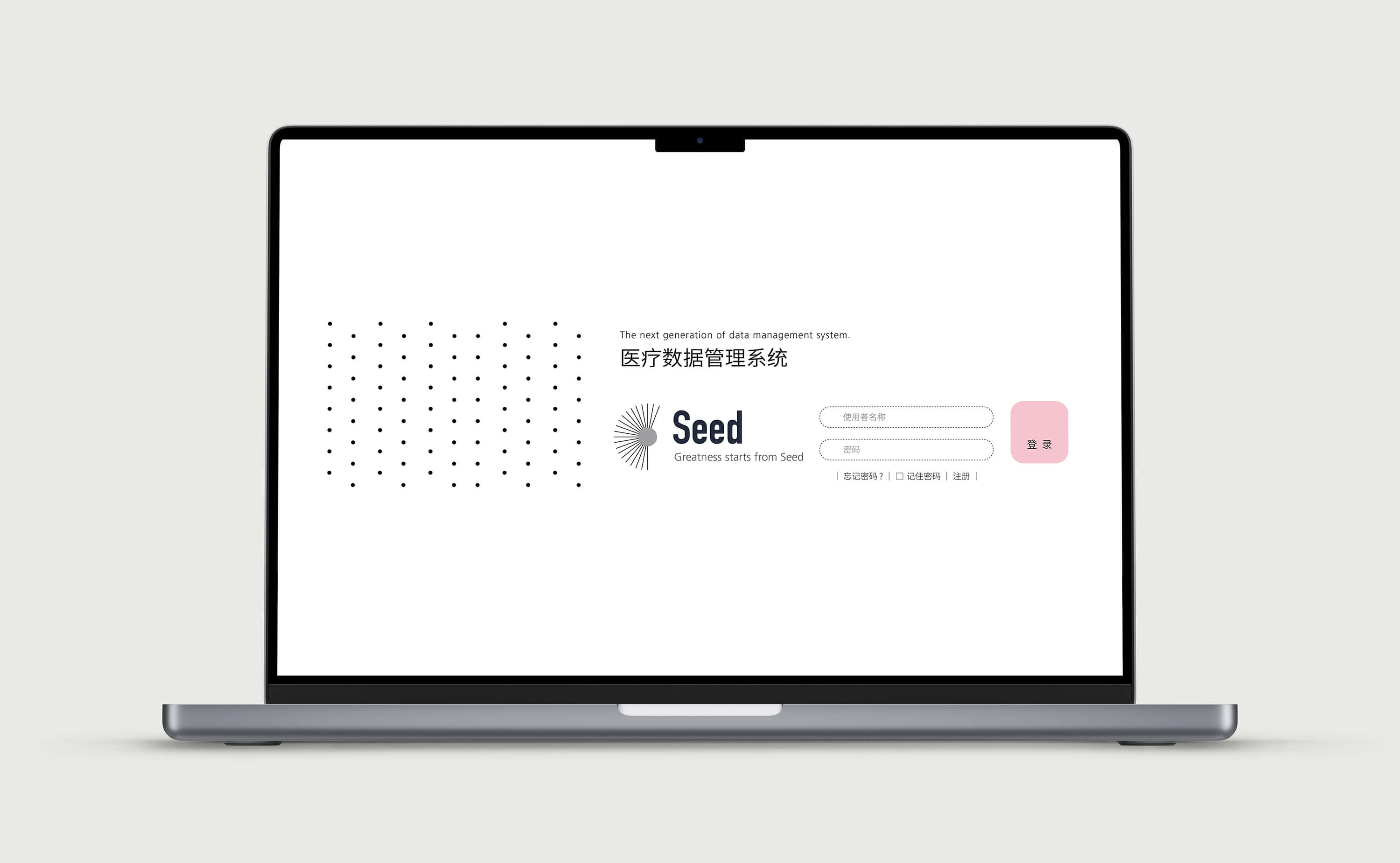
WTHEALTH
WTHEALTH is a professional company specializing in data security management systems. I led the design and production
of the brand identity, website, and system UI. The product, named SEED, is defined by its high scalability. Drawing on this
characteristic, the logo is conceptually based on the dandelion—symbolizing expansion, connectivity, and resilience.
The website adopts a nature-inspired visual language, deliberately moving away from the conventional aesthetics of
technology companies. The goal was to establish a forward-looking visual identity for WTHEALTH that aligns with the
spirit and future vision of the product.